Logos, icons & Infographics
I have designed many logos, icons and infographics for public-facing and internal audiences, for non-profit organisations, corporate documents, internal campaigns and projects, small businesses and more.
Logo design for AIA Vitality Platinum Status, created for insulated keep cups awarded to staff achieving Platinum Status in AIA’s health and wellbeing program.
Selected internal platform, campaign and project logos from Insurance Brands Australia.
Logo design for A New Beginning – Resolving Conflict Peacefully, using Sudan’s national bird in a peaceful stance, a rising sun and colours inspired by the South Sudanese flag to symbolise peace, strength and a fresh start.

Logo design for Devon Wealth, combining flowing parallel lines to symbolise partnership, growth and positive change. A clean, rounded typeface balances professionalism with a sense of warmth and personal care.
University project: Logo design for KO-ERCE, a hypothetical creative agency. The bold ‘KO’ references a knockout punch, conveying creative impact and effectiveness, while the unconventional spelling, forward-leaning type and jagged details create a distinctive, energetic identity.
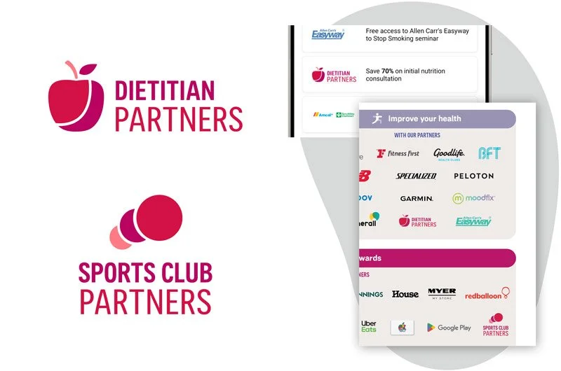
Logo design for AIA Vitality’s Dietician and Sports Club Partners, creating a consistent visual identity across print and digital collateral, including information sheets, app content and webpages.
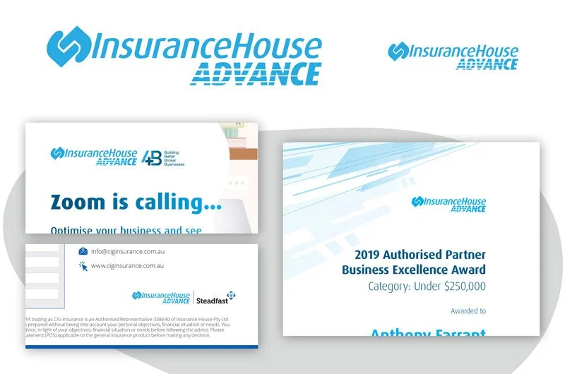
Logo extension for Insurance House Advance, building on the existing brand identity with bold, forward-moving typography to convey speed, progress and momentum.
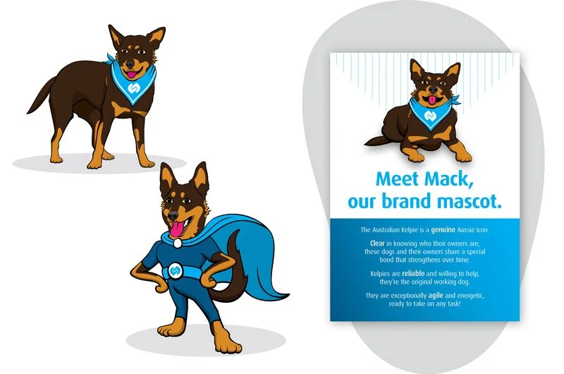
Mascot design for Insurance House’s internal communications, featuring an Australian kelpie to reflect the brand’s values of being genuine, clear, reliable and agile.
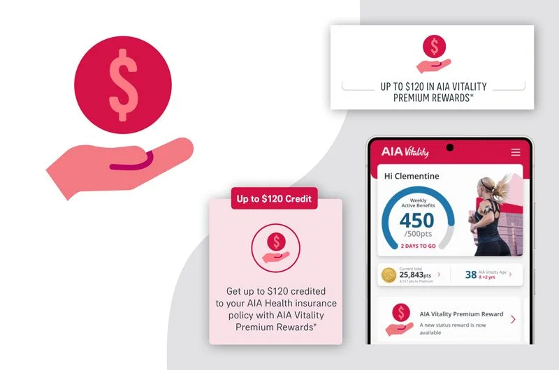
Icon design for AIA Vitality Premium Rewards, created to represent all premium reward stages across print and digital collateral, including information sheets, the AIA Vitality app and webpages.

Logo design for Insurance Brands Australia, representing a house of professional insurance brands through whilst also reflecting their diversity and interconnectedness.
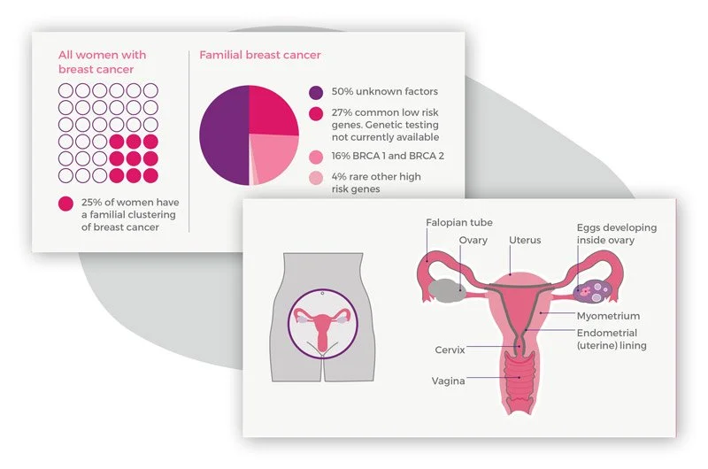
Charts, diagrams and information design for Pink Hope’s My Ovarian and Breast Cancer Risk booklet. Designed in line with brand guidelines to communicate important health information clearly, simply and accessibly.
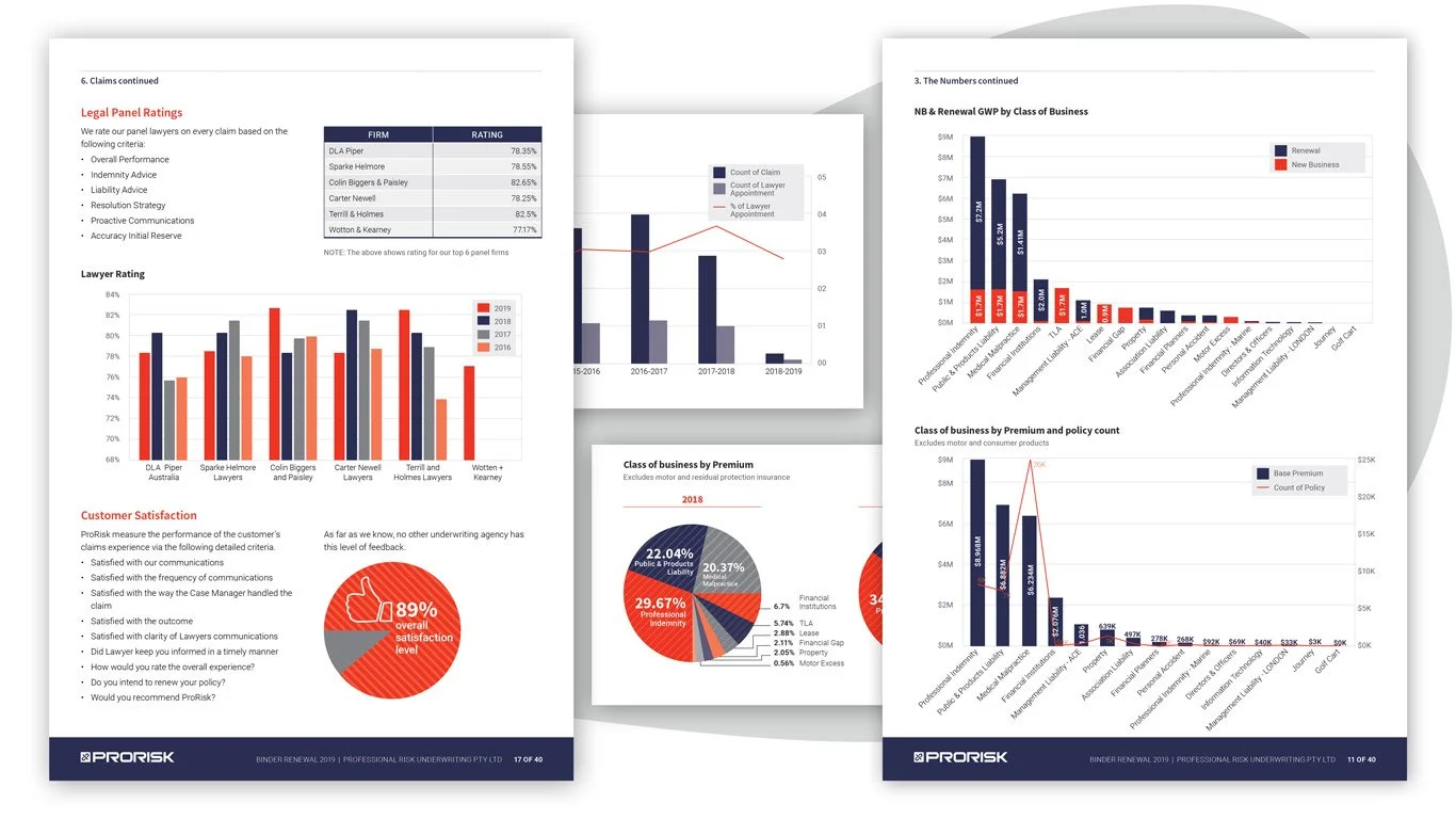
Branded charts and graphs designed to present data clearly and concisely in ProRisk Underwriting Agencies’ binder renewal documents.
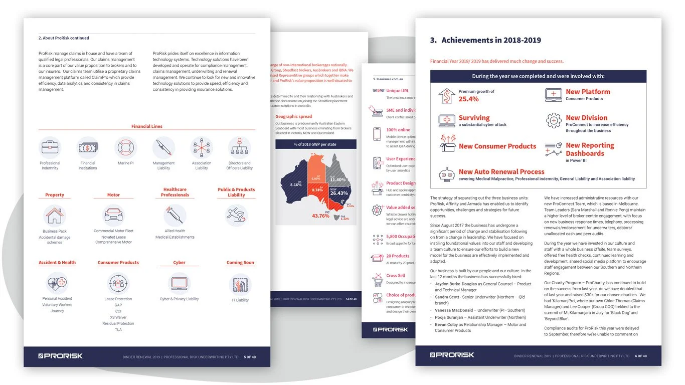
Branded icons and diagrams designed to communicate key products, services, events and other important information clearly and engagingly in ProRisk Underwriting Agencies’ binder renewal documents.